
OUR BOLD NEW LOOK
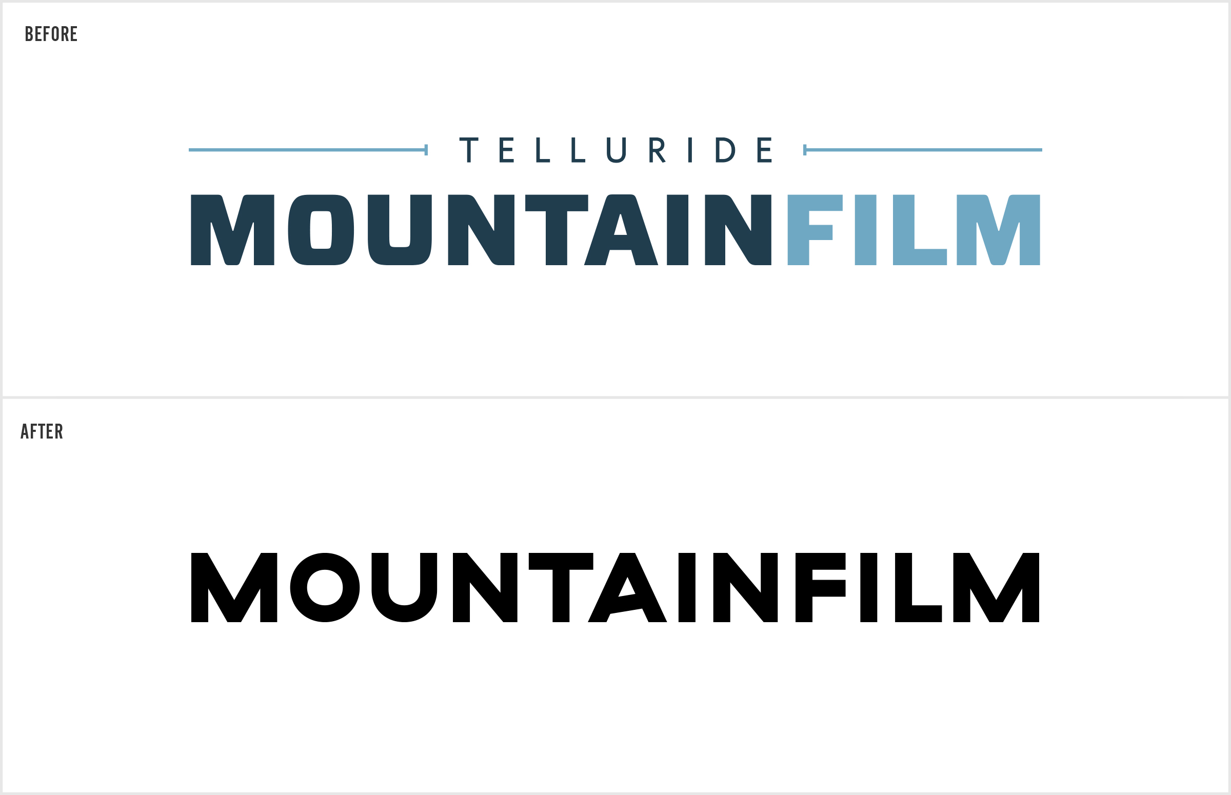
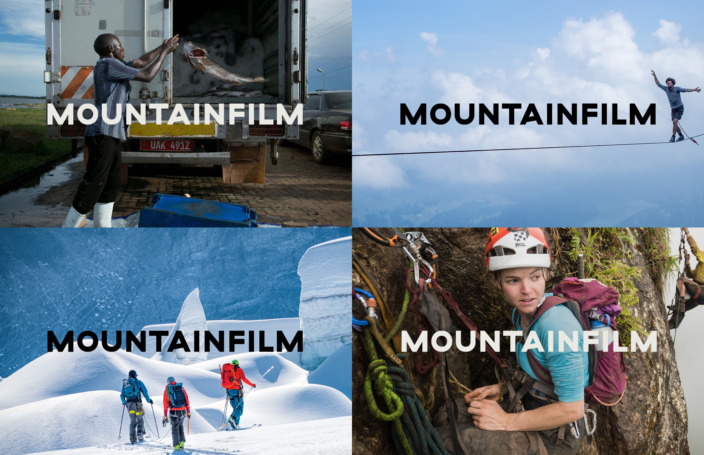
Mountainfilm is thrilled to present a new look in 2017. The organization has grown tremendously over the last several years, and we felt it was time to evolve the brand into something striking and memorable. Rather than taking a full departure from our old logo, we've strengthened the wordmark (which is fancy design speak for our name) with a more grounded and modern look. The angled "A” reflects the upward momentum, progress and inspiration we embrace at Mountainfilm.
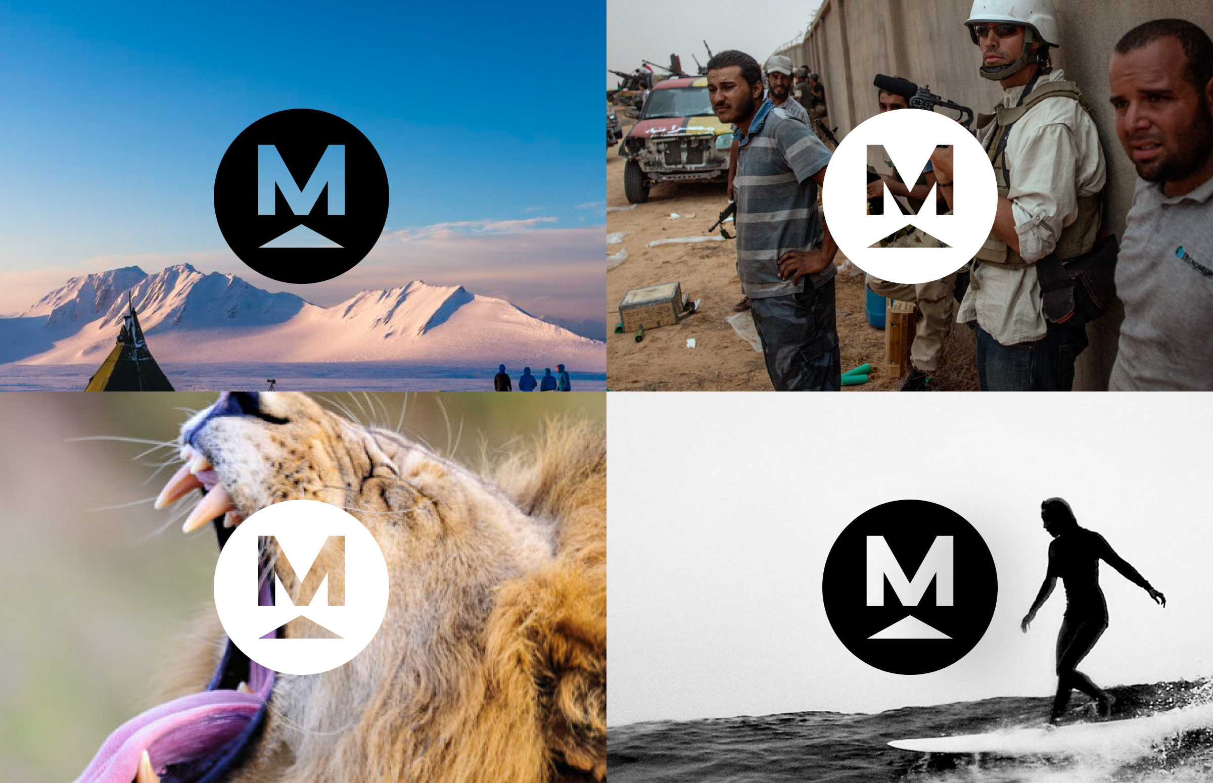
In addition to updating our wordmark, we're introducing a new logomark (another design term, you know what this one means). It's uncomplicated, bold and, we hope, readily recognizable for years to come.
We adopted the colors of Tibetan prayer flags — long an icon of peace and blessings in the mountains that we've embraced — to incorporate into our colors.
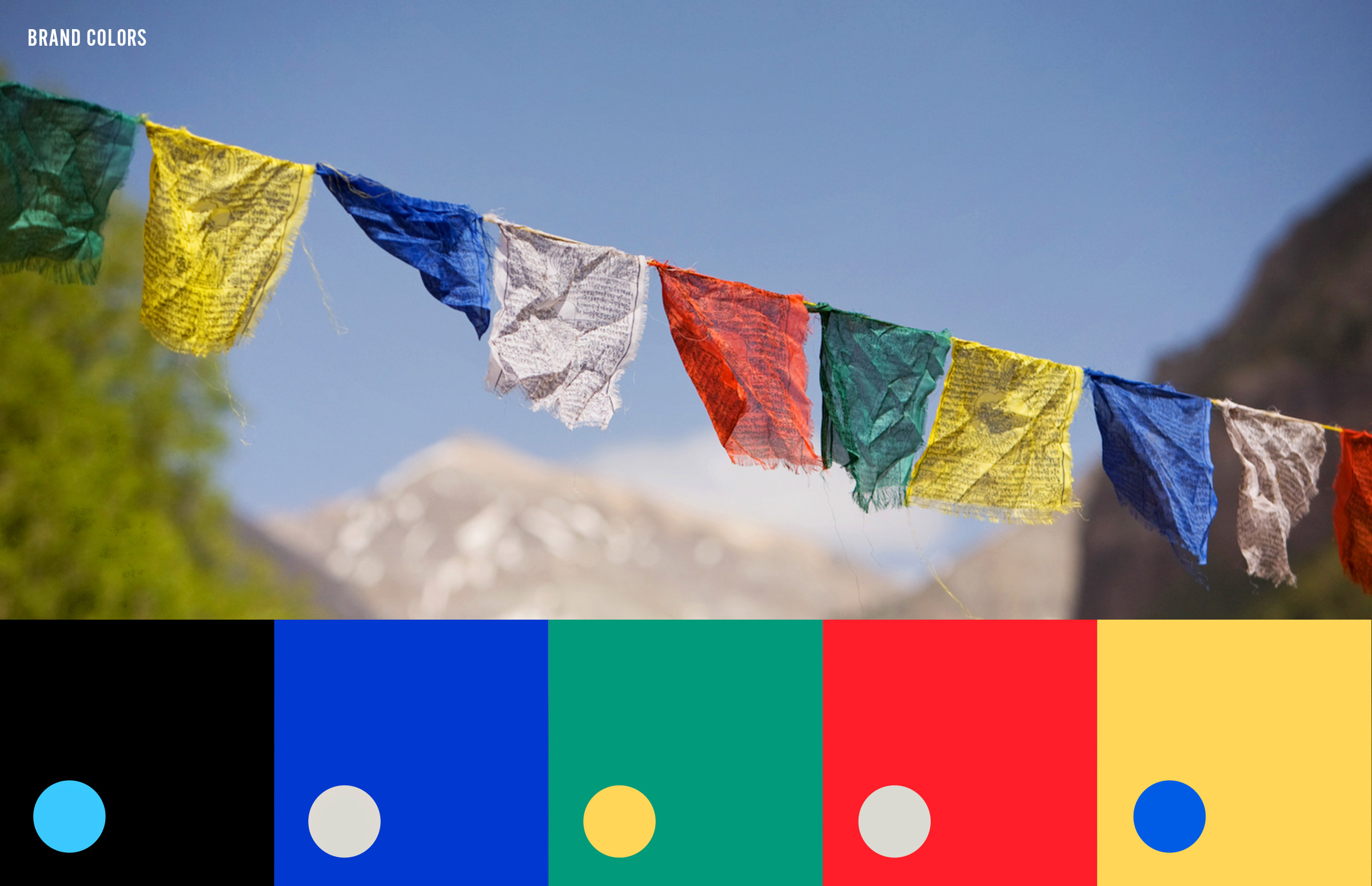
“Mountainfilm worked with the local designer Stephen Rockwood to come up with this new palate, and we're excited to share it with the world,” Mountainfilm Executive Director Sage Martin. "The new logo honors Mountainfilm's history and also enhances our brand recognition.”
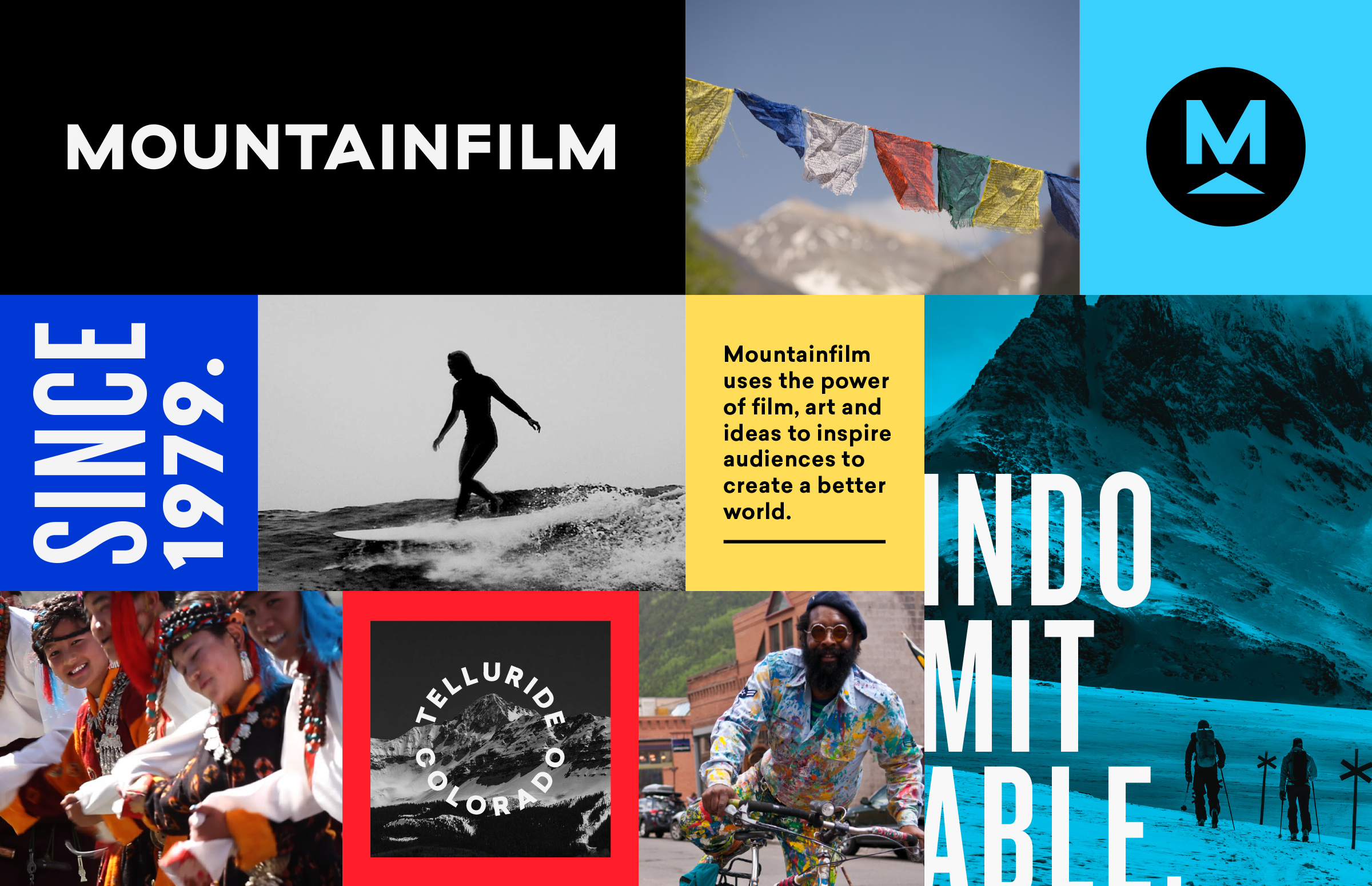
The rollout of the new brand identity will continue into the festival with new signage, banners and apparel. We sat down with Rockwood to talk design, colors and collaboration with our (sometimes opinionated) staff.
Why did you want to work with Mountainfilm?
It’s the type of organization I’ve become more and more attracted to working with from a creative standpoint. I felt like I could have the opportunity to work with like-minded people who have experience in the industry but are also are working toward something bigger than the festival itself, to a more deeply rooted cause. That gave more purpose to the work.
Talk a bit about the process.
The design process was a mix between collaborative experiences and one-on-ones with staff members. Everybody contributed, and there were always opportunities for feedback, which allowed everyone to have a voice. That can get tricky, but we found a way to come to an awesome visual solution that everyone was able to rally behind.
What do you like about this design package?
SR: We found a solution that really honors artists and filmmakers first. The design takes a backseat approach to the high-caliber and constantly changing content Mountainfilm represents. The logomark is subtle enough to work with a wide range of content but strong enough to be memorable and last for years to come.
What is your favorite thing about the new look?
The subtlety of the angled “A” is a unique moment that has a strong conceptual meaning but is also Mountainfilm’s little quirk that makes it what it is. I also love the logomark. It’s one of the simplest logomarks I’ve ever designed, but I’m confident in the approach we took and where we landed with it. I’m excited to see it age and age and age for a long time.
Tell me about the color palette:
Knowing that the prayer flags mean a lot to us here in the mountains and this organization, those colors were obvious to pull into the brand. The colors work as an organizational tool and also provide a consistent look.
Stephen Rockwood, 30, is a snowboarder, climber and graphic designer who has lived in Telluride for nearly two years. He is originally from Florida, but is taking quite well to the mountains. Check out his work at stephenrockwood.com.


